Charts
Charts
A chart or a graph is simply a visualization of spreadsheet data. A chart can create a clear picture of a set of data and allow users to better understand the results and see patterns inside the data.
Basic types of charts
In order to use charts effectively, you'll need to understand how different charts are used. The type of chart you choose depends on the type of data and the way you want it to be presented.
Column Chart
The column chart is suitable for viewing changes in data over a period of time and comparing them. In the diagrams, data series are usually organized along the horizontal X axis and the values along the vertical Y axis.

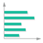
Bar Chart
Displays values for one or more series using horizontal columns. In a bar chart, the categories are typically organized along the vertical axis, and the values along the horizontal axis.
Pie Chart
Pie charts make it easy to compare proportions. Each value is shown as a slice of the pie, so it's easy to see which values make up the percentage of a whole.

Line Chart
Displays values as equally spaced points connected with a line. This chart is most useful displaying trends over time or other ordered category for single or multiple data series.

Creating a chart
To create a chart:
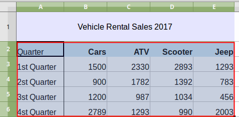
1. Select the data to be included in the chart, include row and column headings but not the title for the data table.
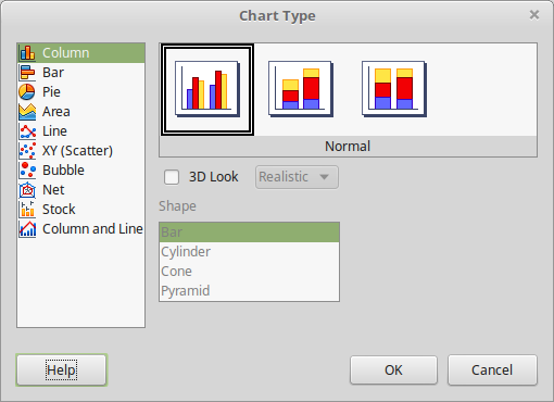
2. Now the Chart Wizard opens. In the first step select the Chart Type and optionally change some options specific to each chart type. For example for the Column chart you can change to a 3D look.

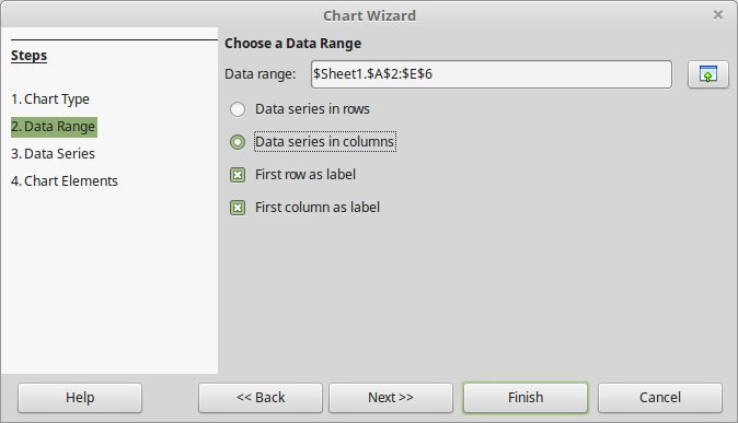
3. In this step Calc recognizes the Data Range of your chart. Leave the default values.
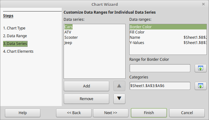
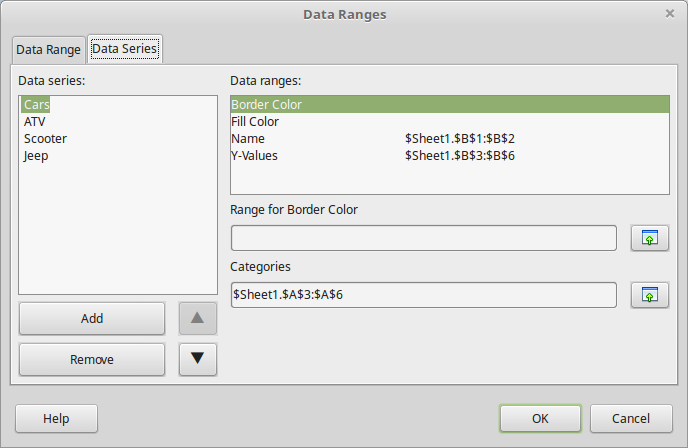
4. Each Data Series represents a column of your data. In our example there are four data series. In this step you can reorder, add or remove data series.
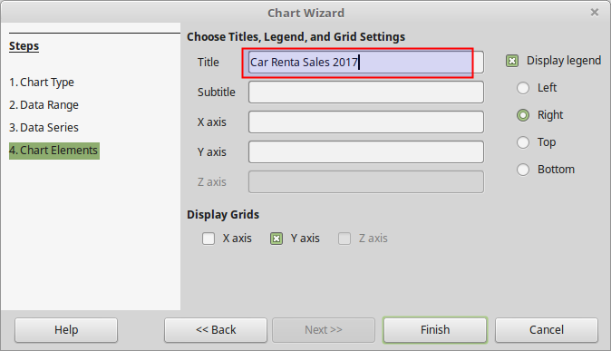
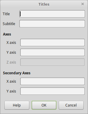
5. In the last step you can set labels for the Title, Subtitle and for each axis. You can also disable or change the position of the chart legend.
When the wizard finishes the chart is inserted inside th spreadsheet as an object. Note that a chart is a dynamic object which means it is updated whenever the source data change.

Chart elements
A chart inserted into a sheet behaves both as graphic object and as chart object. When you click into chart you can resize and position the object. Before learning to edit chart you must become familiar with the chart elements or parts.
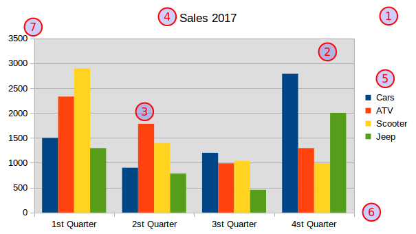
- Chart area. The area surrounding the entire object of the chart. It includes the chart wall and all other parts.
- Chart wall. The area enclosed by the two axes where the actual chart is drawn.
- Data series. A set of related values, representing a row or column of data. A chart can only have one or more data series.
- Title. A label useful for setting the title for the diagram.
- Legend. The legend shows which data series each color on the chart represents.
- X axis. In the two-dimensional diagrams, there are two axes - the horizontal axis X and
- the vertical Y axis.
Editing charts and graphs
Calc provides tools for changing the chart type, chart elements, data ranges, fonts, colors, and many other options. To change chart properties you mus first double click inside a graph to enter chart edit mode. In this case the chart toolbar appears on the Calc window.

Formating chart parts
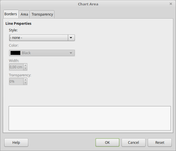
To format a chart part select the part from the drop-down menu and click the Format Selection button. The formating window opens where you can change borders, area and transparency options. The example below shows the formatting window of the Chart Area element. Alternatively you can use the Sidebar to format a selected chart element.
You can also format the Chart area with the ![]() button and the Chart wall with the
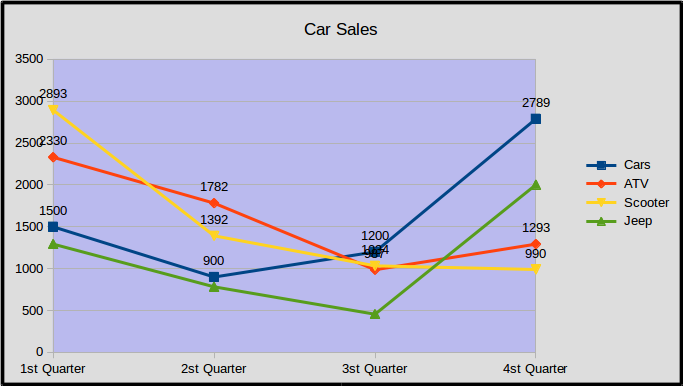
button and the Chart wall with the ![]() button. In the example below the chart wall has different color then the chart area.
button. In the example below the chart wall has different color then the chart area.
Changing chart type
You can change the chart type any time by clicking the ![]() Chart Type button on the toolbar. Set the new chart type in Chart Type window.
Chart Type button on the toolbar. Set the new chart type in Chart Type window.
Data Ranges
A chart draws data from a range of cells in a spreadsheet. Click the Data Ranges ![]() button to open the Data Ranges window. Data in a chart are divided in data series. By default a series represents a column in your data. However you can change this option to Data series in rows.
button to open the Data Ranges window. Data in a chart are divided in data series. By default a series represents a column in your data. However you can change this option to Data series in rows.

In the Data Series tab you can change the order, add or remove data series.
Titles
You can put text in some parts of a chart. Click the Titles ![]() button to bring the Titles window. In this window you can enter a Title and Subtitle for the chart and text labels for both axes.
button to bring the Titles window. In this window you can enter a Title and Subtitle for the chart and text labels for both axes.
Legend
The legend shows which data series each color on the chart represents. To display or hide the Legend click the ![]() Legend button. To format the Legend and change the position click the
Legend button. To format the Legend and change the position click the ![]() Format Legend button.
Format Legend button.

Data Labels
Data labels display the data value for a data series in a chart. To insert Data Labels right click on a data series and choose the Insert Data Labels command. Repeat this process for all data series.

Exporting as Image
You can export a chart as a png image in order to use it to another application. To export a chart as an image simply
- Make sure you are not in chart edit mode
- Right click on the chart
- Select the Export as Image
- Set a name and location for the image file.